When we decided to jump both feet firmly into our BB venture we began with two things. Creating a product list and finding a name. Bakers Dust was the name. Because of the Dust that is left behind in the process of baking. We loved the name and we loved what we could do with it visually.
The first logo designs
Designing our logo came soon afterwards. During my Christmas dinner with family, a cousin of my boyfriend said that her husband (Mattia Cabras) is a motion graphics designer and that I should ask him to design our logo. He was wiling to help out and a few weeks later we sent him over some ideas that we had for the logo. He came up with the following 3 designs:


We liked the first and last option.
New business name
At this point though, we started to ask some more friends and family for input about the name. Daks, a friend of mine, said that he Googled ‘Bakers Dust’ and all that came up was bakers’ astma. As a direct result of the dust that bakers inhale from the flour they use they can develop a condition called bakers’ astma. As much as we loved the name, we knew we had to ditch it.
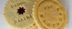
A few weeks later Lisa came up with Bloom Bakers and that just felt like us! When she said it out loud in her kitchen whilst baking we both just knew that had to be it. With the sole contingency that the social media handles were not yet taken… Which they weren’t
A more daring logo
Even though we liked some of Mattia’s initial designs, we felt that the ideas were a little bit too safe. Too much like what others have already done. Call us ambitious, but we wanted to create brand. A logo that people would take serious and would recognise instantly.
In the mean time, I had been sitting behind Photoshop as well. But I was a bit nervous. This is not my field of expertise and what I had made was so far removed from what Mattia had been making. But most of all I was nervous for Lisa’s reaction. Was she going to hate it? Because if she did, that would kinda hurt my feelings… Yes, that is how sensitive I am.
I showed her the design and she loved it.
Polishing up our logo
We decided to send the above rough design over to Mattia accompanied by the following email to see if he could work with it. Prettify it. And make it feel more germanic/nordic.
So I have been a wee bit bussy on photoshop myself. I like messing around with it, but I have not designed much of anything ever. But I wanted to give you a sense of what kind of Logo we are thinking about. Have a look at the attachments and tell me what you think (like your true honest opinion). And maybe have a play around with the design and see how you can make it better. Or maybe make a couple of other ideas based on it. Becasue this is as far as Photoshop will take me.
Let me know if you want the raw files. I can send them over to you this evening.
Thanks so so much!
Saskia
He took it to town and came back with what we loved. Most of the work went into perfecting the double B’s, designing the wheat stalk that runs over them, the fonts and softening the design. What might look like minor changes to some is in fact a complete overhaul of my initial design. Something I could have NEVER EVER accomplished!
![]()
Over the following weeks we send him too many emails with minor tweaks and changes. One of which was the colour. The colour in my original design was a little weak so we made it the colour yellow from Lisa’s wedding bouquet. Poor man, we drove him crazy with our very specific requests. But Mattia took my rough design and made is smooth, refined, simple!
![]()
We LOVE that it is simple, fresh, different, it feels Nordic and the colours really represent our spirit. The brand really carries quite far as it is not comparable to any other logo around. We also love that he doubled the pentagons and softened the edges. We feel it represents the bloom from our name, the Yorkshire rose and the fact that there are two of us!
Mattia, we know this was a detour from your usual work which is much cooler and funkier, but what you did for us was so so good, kind and so much appreciated!!!!
UPDATE 2018
In the spring of 2018, we rebranded with a new website. And we needed a logo that represented all that had changed in the past 2 years. The strapline didn’t feel relevant anymore. And the logo was overly complicated. So we went back to Mattia with the simple request to make the logo simpler.
![]()